Quiet Color, Lasting Grace

Today we explore color palettes that express subtle elegance at home, weaving together undertones, light, texture, and finish so rooms feel naturally composed rather than carefully staged. You will discover nuanced pairings, practical testing methods, and small, reversible changes that make a surprisingly profound difference. Whether you rent or own, we will help you craft inviting spaces that age beautifully, welcome conversation, and soothe busy minds without sacrificing personality, warmth, or everyday livability. Settle in, gather a few paint chips, and let gentle color guide your next refresh.

Foundations of Gentle Color

Subtle elegance begins with patiently noticing undertones, how daylight shifts across surfaces, and the calm created by restraint. Instead of chasing bold statements, you balance warm and cool notes, soften contrasts, and allow texture to carry interest. This approach invites quiet confidence, where every wall and object seems to breathe. That breath becomes your design compass, helping you edit rather than accumulate. The result is an atmosphere that holds silence kindly, welcomes conversation tenderly, and reflects your life with tender accuracy rather than loud declarations.

Palette Pairings That Whisper
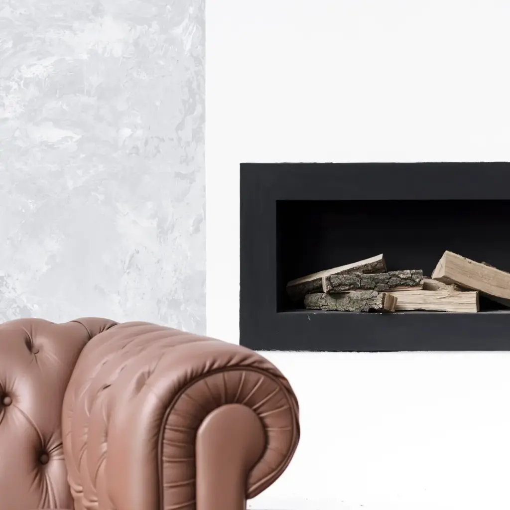
Consider pairings that suggest conversation rather than proclamation: airy ivory with grounded greige, powdery sage with linen beige, taupe with soft chalk white. Such combinations behave like well-mannered guests, personable but never demanding attention. They invite you closer, revealing complexity over time. By maintaining a small tonal gap among hues, you create subtle transitions that feel sophisticated without being stiff. Layer these palettes through walls, textiles, and accents, and you will notice rooms becoming kinder to the eye, to routine, and to long, lingering evenings.

Greige and Ivory

A warm greige wall paired with ivory trim can calm busy art and vintage furniture, letting silhouettes feel crisp yet forgiving. Add oatmeal linen drapery and a pale wool rug to carry the tone-on-tone story. Brass or aged bronze accents deepen the composition without stealing attention. In bright daylight, ivory keeps edges luminous; by lamplight, greige develops a soothing, enveloping glow. This pairing travels well between open-plan spaces, providing continuity while still allowing each zone to express its own gentle personality.

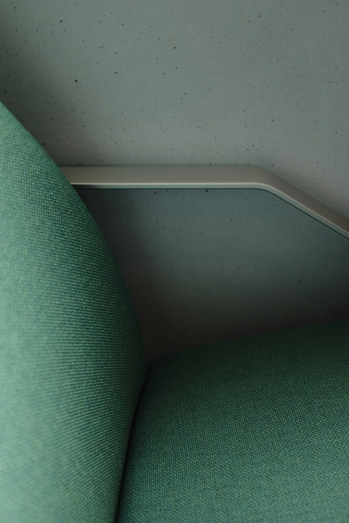
Sage and Linen Beige

Muted sage evokes softened garden greens, partnering beautifully with a linen-beige sofa or plaster-toned cabinetry. The result is airy and rooted at once, an indoor-outdoor handshake. Sage balances coolness with an earthy hush, so rooms feel composed in summer and comforting in winter. To enhance, weave in textured throw blankets, raw wood bowls, and matte ceramic lamps. Keep patterns understated—delicate stripes or herringbone—to preserve the calm dialogue. The palette adjusts gracefully to changing seasons, always offering a peaceful, restorative gaze.

Materiality, Texture, and Finish

Color alone cannot deliver subtle elegance; surface texture and paint sheen complete the effect. Limewash, plaster, and matte finishes scatter light in forgiving ways, while eggshell and satin add delicate refinement where durability matters. Natural fibers, unsealed woods, and softly honed stone introduce tactile variation that reads as depth rather than busyness. The interplay of muted color with thoughtful materiality keeps rooms engaging at close range. It rewards touch and slows movement, making ordinary routines—pouring tea, folding linens—feel gently ceremonial and beautifully grounded.

01

Matte, Eggshell, and Satin

Matte hides minor wall imperfections and creates velvety softness, ideal for living areas seeking serenity. Eggshell balances ease of cleaning with restrained sheen, perfect for hallways or bedrooms. Satin, used sparingly, brings quiet crispness to trim or cabinetry without leaning glossy. Matching sheen strategically across adjoining surfaces avoids awkward transitions. Always sample finishes together under your actual bulbs, because sheen amplifies or subdues undertones. You are composing light behavior, not just color, shaping how every surface greets the day and settles into evening.

02

Soft Textiles That Harmonize

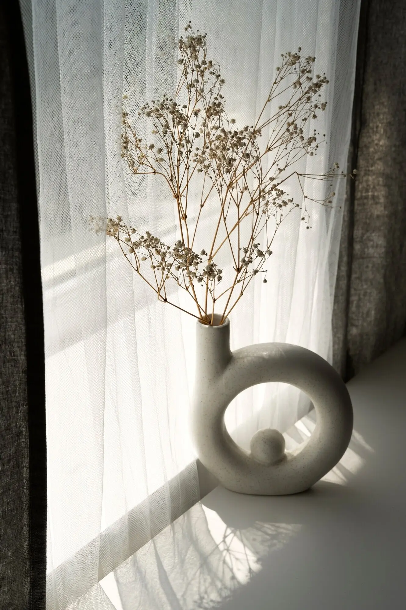
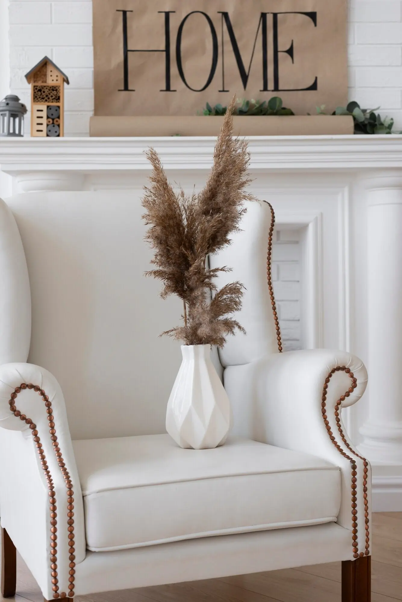
Choose textiles that echo your palette with subtle shifts: nubby bouclé in warm ivory, wool throws in feather-gray, linen cushions with barely-there stripes. Texture becomes your pattern, adding interest without breaking calm. Avoid overly high contrast; instead, layer tonal variations that feel like gentle echoes. This cohesion allows a single accent—perhaps a vintage book spine, a clay vase, or a sprig of greenery—to read as quietly significant. The result is depth you sense more than see, an elegance that lives in the fingertips.

03

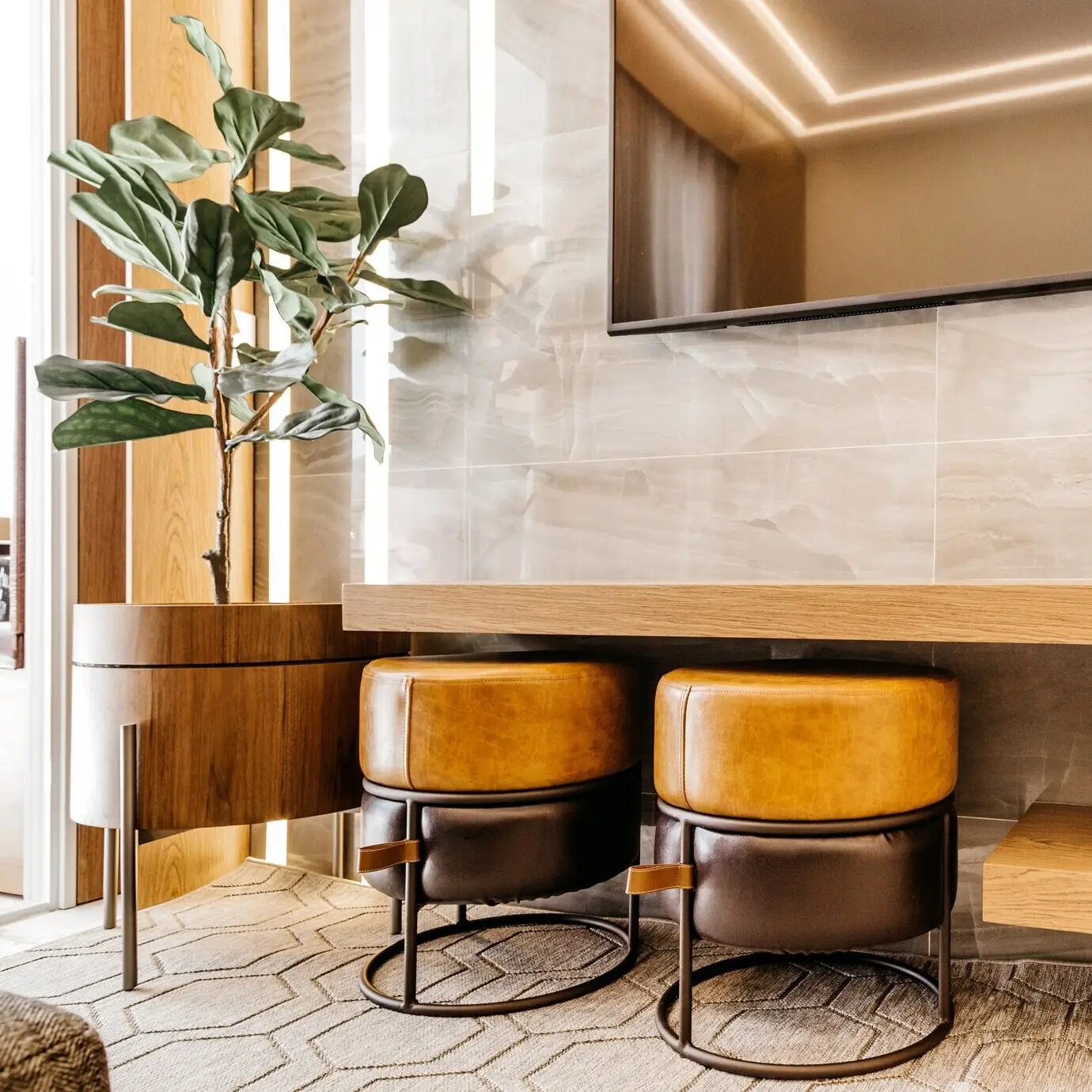
Stone, Wood, and Patina

Softly honed marble, soapstone with subtle veining, or limestone with fossil flecks can anchor neutrals without shouting. Pair these with woods that carry gentle warmth: oak with a natural finish, ash with minimal stain, walnut left slightly matte. Patina accumulates stories, so embrace small scuffs and sun-kissed edges. These materials collaborate with restrained palettes to create an atmosphere that feels respectfully lived-in. When color is quiet, patina sings a low, beautiful note that honors time, use, and the art of daily life.

Living Spaces That Breathe

In living rooms, limit competing focal points. A greige envelope with ivory trim frames a muted landscape painting and a single reading lamp with a parchment shade. Add a low-sheen walnut table and textured rug for grounding. Keep throw pillows in tonal harmony, reserving a faintly blued-gray for gentle emphasis. The result encourages conversation and lingering, not constant rearranging. Window treatments should filter glare, not block life. When guests arrive, the room receives them like a steady friend: attentive, relaxed, and quietly gracious.

Bedrooms for Restorative Stillness

Sleep spaces benefit from hushed colors that deepen with dusk. Consider mushroom walls, pale linen bedding, and a chalky bedside lamp. Avoid stark contrast near the headboard; let the eye rest. Layer textures—waffle blankets, washed linen, soft wool—to create a cocoon without visual clutter. Keep metal finishes mellow, like brushed brass, to echo warmth. A small vase with a single branch accomplishes more than a crowded nightstand. The room should whisper goodnight, and each morning, greet you with a gentle, unhurried breath.

Kitchens and Dining with Poise

Kitchens can carry subtle elegance through painted cabinetry in softened shades—sage, mushroom, or warm gray—paired with chalk-white walls and honed stone. Use satin on doors for resilience, matte or eggshell on walls for calm. Reduce hardware shine to brushed or antiqued metals. In dining areas, choose linen slipcovers or wood chairs with natural finishes to avoid a showroom gloss. Let candlelight curve across gentle surfaces during meals. The palette invites appetite and conversation without distraction, turning routine dinners into familiar, restorative rituals worth repeating.

Accents That Breathe Rather Than Shout

Opt for brushed nickel, antiqued brass, or burnished bronze to harmonize with restrained palettes. Highly polished finishes can feel abrupt under bright light, while dulled metals cast a softer glow. Repeat the same metal in small doses across a space to foster cohesion. A slender picture frame, a lamp finial, a cabinet pull—these quiet glints act like commas, guiding attention. The room reads as thoughtful rather than decorated, with light catching subtly at dusk and reflecting stories rather than shouting novelty.
Hang fewer pieces and give each room to breathe. Off-white mats and thin frames help artwork sit within calm palettes without competing. Consider charcoal sketches, line drawings, or landscapes with gentle horizons. Negative space is not emptiness; it is respect for the eye. Allowing quiet around art slows viewing and honors emotion. When you add a new piece, remove another, sustaining balance. This mindful rhythm makes the collection feel curated by meaning rather than accumulation, a living gallery that deepens with time and memory.
Bring in branches with delicate leaves, textured stones, or shells in chalky tones. These elements echo the palette and add irregularity that feels human and grounded. Avoid overly saturated florals when seeking subtlety; choose pale blossoms or simple greenery. Rotate seasonal touches thoughtfully, keeping the foundational color story intact. Nature’s muted textures teach restraint, reminding rooms to feel alive without feeling busy. Over time, this practice builds rituals—weekend walks, small arrangements—that keep your home attentive to seasons and generously welcoming to quiet wonder.

A Townhouse Finds Its Calm

A busy family replaced stark white with warm ivory and greige, unifying mismatched furniture. The living room’s mushroom walls softened evening glare, while ivory trim sharpened lines with kindness. They swapped glossy fixtures for brushed brass, dimmed bulb temperature, and layered a wool rug. The result? Less visual noise, calmer homework hours, and more relaxed evenings. Guests noticed the change as a feeling, not a makeover. It registered as ease, as if the home finally exhaled and invited everyone to breathe with it.

A Rental with Removable Layers

Without repainting, a renter achieved quiet elegance through textiles and light. Linen curtains filtered harsh afternoon sun; a textured rug grounded the room; cushion covers in sage and oat relayed a gentle palette. Peel-and-stick artwork frames minimized wall damage while adding balance. A slipcover over a loud sofa muted contrast. Lamps with parchment shades turned nights cozy and focused. When the lease ended, everything packed easily, proof that subtlety is not a luxury of permanence, but a practice of thoughtful, portable choices.

Try, Share, Refine: Your Gentle Palette Journey

Subtle elegance grows through small experiments shared openly. Start with sample pots, fabric swatches, and a willingness to observe. Photograph walls at different hours to understand how color behaves in your real life. Keep notes on undertones and sheens, then refine choices without rushing. When you notice calm arriving, invite it in further with texture and considered accents. Share your progress, ask questions, and subscribe for more color studies, real-home diaries, and reader Q&A. Together, we can build a library of quiet, lasting beauty.
Xomevixovomukepimafo
Privacy Overview

This website uses cookies so that we can provide you with the best user experience possible. Cookie information is stored in your browser and performs functions such as recognising you when you return to our website and helping our team to understand which sections of the website you find most interesting and useful.