Light, Quiet Luxury: Creating Serene Spaces

Today we explore lighting strategies for a calm, high-end interior, translating technical choices into feelings of ease, privacy, and understated sophistication. From soft layers and precise color temperatures to hidden architectural sources and intuitive control, you will learn how light sculpts silence, flatters materials, and supports daily rituals, while avoiding glare, visual noise, and restless contrasts.

The Psychology of Gentle Illumination

Calm rooms begin with how light lands on the eye and skin. Diffused sources lower cognitive load, soften edges, and quiet the nervous system, especially when balanced with warm color temperatures and high color rendering. Here we translate neuroscience into practical moves, ensuring elegance never feels clinical, and serenity grows from measured brightness, graceful gradients, and shadows that feel intentional rather than accidental. Every choice safeguards comfort and sustains a composed, luxurious presence.

Layering Without Clutter

Combine ambient, task, and accent lighting to create a cohesive atmosphere where no single fixture shouts for attention. A cove or recessed wash establishes calm baseline illumination; focused task pools add purpose; small accents draw attention to texture. Together they read as one, letting the eye rest while materials show depth without busy reflections or competing highlights. This quiet composition anchors emotional ease and communicates confident restraint.

Color Temperature That Sets the Mood

Warm white around 2700–3000K encourages relaxation and a sense of evening intimacy, while slightly cooler 3000–3500K supports focus in kitchens and studies without harshness. Keep within a tight range across rooms to avoid jarring transitions. For art and natural materials, pair warmth with excellent color rendering so tones remain vivid yet tranquil. Thoughtful consistency keeps attention on textures, conversations, and comfort, not on distracting, mismatched glows.

Architecture That Hides the Source

Luxury emerges when light appears to come from nowhere, washing surfaces in soft gradients. Integrate coves, recessed slots, and concealed brackets so illumination is revealed only through its effect. Design details matter: plaster-in trims, glare shields, and precise mounting heights keep eyes comfortable and sightlines clean. The result is a calming balance where architectural rhythm leads and fixtures remain politely invisible, yet every corner feels thoughtfully composed.

Coves and Slots That Breathe

A delicate ceiling cove can lift the room visually, widening evenings and lending an almost spa-like stillness. Maintain consistent setbacks, specify continuous diffusers, and choose LED tape with tight binning to avoid banding. Slots along walls can define axes, guide movement, and support artwork without competing with it. When the source is hidden and edges are crisp, the architecture feels lighter, and the mind follows with grateful calm.

Wall Washing Versus Grazing

Use wall washing to spread uniform brightness across fine plaster, cabinetry, or canvas, allowing textures to read without drama. Choose grazing only when stone cuts, fluting, or linen weaves deserve deliberate shadows, and control distance carefully to prevent harsh scallops. By selecting the right strategy for each surface, you tell a visual story with confidence, where serenity results from controlled emphasis rather than uncontrolled contrast or accident.

Materials and Finishes That Love Light

Serenity arrives when materials and light honor each other. Alabaster shades, opal glass, woven linen, brushed brass, satin nickel, oiled oak, and limewash each interact differently with intensity and color. Favor finishes that diffuse sparkle into a velvety sheen rather than scattered glare. The aim is a quiet luster that rewards touch, steadies the gaze, and elevates detail without shouting. Light becomes a companion to craft, not a rival.

Shades, Diffusers, and Fabrics

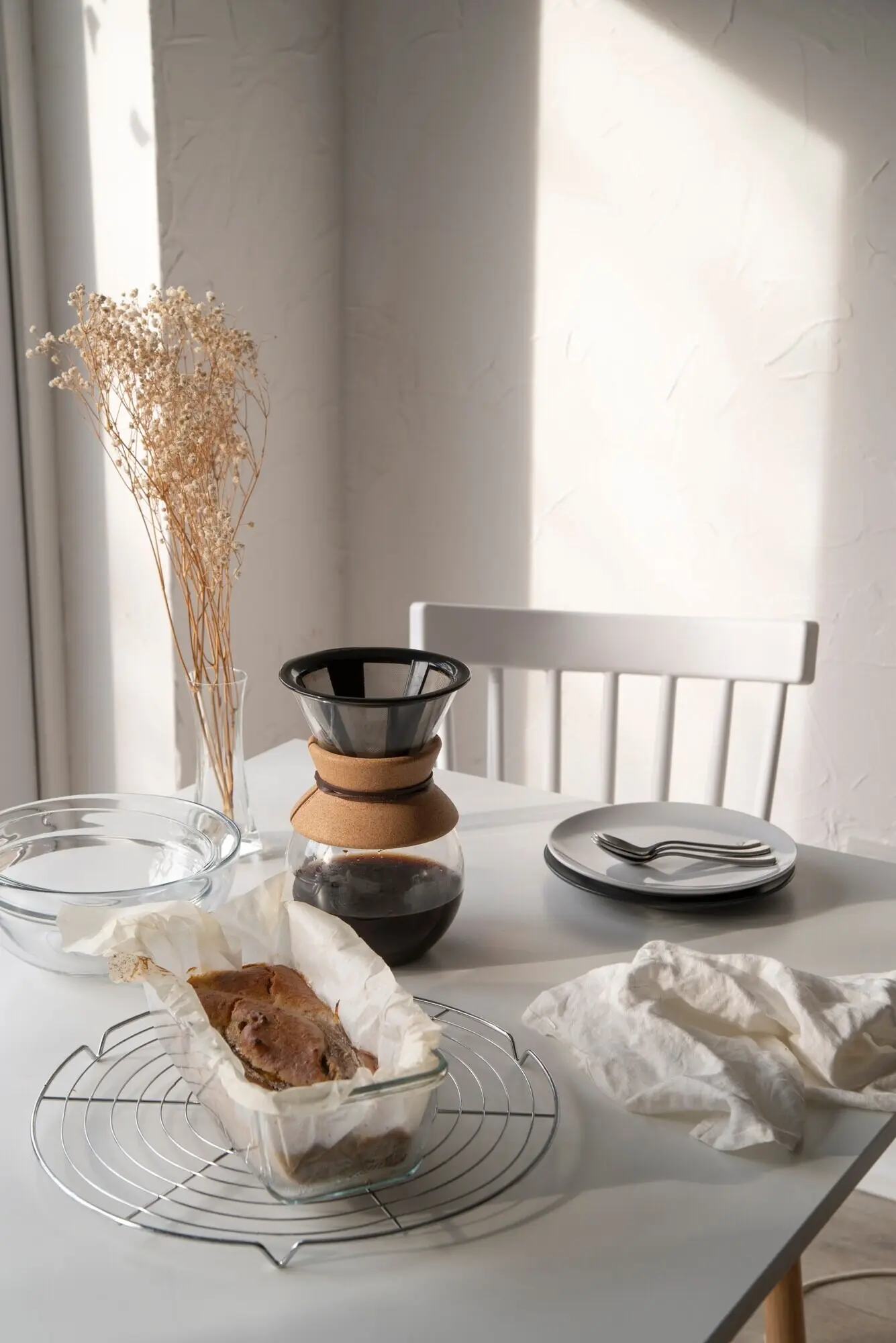
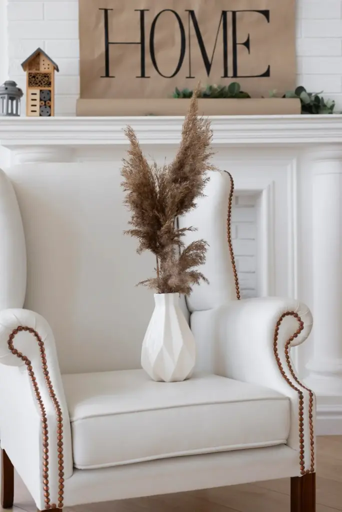
Choose shades that soften edges while preserving clarity. Double-layered vellum, pleated silk, and fine linen can turn small luminances into broad, gentle pools. Opal glass avoids hotspots and flatters skin tones at dinner. Test samples under real bulbs, not showroom approximations, and photograph at different dim levels. The right diffuser expands emotional comfort, creating a halo that flatters faces, finishes desserts, and sustains conversations long after noise would normally rise.

Metals, Stone, and Wood in Dialogue

Brushed or satin metals catch light quietly, avoiding mirrored spark that agitates. Honed stone glows softly under grazing, revealing mineral character without glare. Oiled oak deepens under warm LEDs, reading as grounded and sheltering. Keep one hero texture per vignette, letting others support without competition. This restraint allows illumination to gather gently on surfaces, building a cohesive aura that whispers quality with every subtle reflection and shadow.

Sculptural Pieces That Whisper

Statement fixtures can be serene when their language is balanced: slender profiles, matte finishes, and diffused nodes instead of bare points. Think alabaster discs, hand-rubbed bronze branches, or linen-draped lanterns tuned to dim-to-warm modules. Place them where they punctuate rituals—over a dining table, beside a reading chair—so form follows feeling. When sculpture supports habit and comfort, the result reads empathetic, intimate, and enduringly refined.

Daylight, Views, and Rhythms

Natural light is the original luxury, and it must be orchestrated with equal care. Sheers temper glare while preserving view; layered treatments shift from morning clarity to evening cocooning. Surface choices amplify daylight without harsh bounce: eggshell paints, limewash, and matte stone absorb just enough. Respect orientation and neighbors; then your electric layers can complement, not fight. The room breathes with the sun, staying composed through seasonal and daily changes alike.

01

Sheers, Layers, and Privacy

Start with a fine sheer that cuts glare and diffuses street movement, then add a lined drape or roman for night. Motorize if budget allows, tying scenes to sunrise and sunset for seamless transitions. Reflective films can help control summer heat while preserving soft interior tones. When the view is curated and light is moderated, the mind settles effortlessly, making even small spaces feel luxurious, generous, and safe.

02

Orientation and Reflective Strategies

North light is cool and even, asking for warmer electric fills; south light can be abundant, calling for subtle absorptive surfaces and deeper dimming ranges. East brings gentle mornings, west invites golden evenings but potential glare. Place mirrors to double views, not hotspots; select matte finishes where sun lands directly. By anticipating the day’s arc, you maintain balance, saving eyes from fatigue and preserving that enveloping hush.

03

A Story of an Apartment That Exhaled

In a compact city apartment, we lowered color temperature to 2700K, added a narrow cove, and layered sheers over blackout rollers. The owner reported sleeping deeper and lingering longer at the table with friends. Nothing flashy changed—just light, patience, and restraint. The lesson: when brightness respects behavior, rooms support life beautifully, easing stress without demanding attention, and suddenly home feels like a quiet, polished retreat.

Color Rendering, LEDs, and Consistency

High-CRI and the Magic of R9

A CRI of 95+ with strong R9 keeps tomatoes appetizing, walnut rich, and skin healthy-looking. Under lower-quality light, luxury materials can flatten, losing the very character you invested in. Test lamp samples at dinner and dusk, and compare photographs. Your perception will catch subtle differences quickly. Choose quality once, and every evening reflects that decision, reinforcing a feeling of considered ease and lasting refinement.

Mixing Temperatures With Intention

You can mix 2700K and 3000K successfully if you assign each a purpose—warmer for relaxation, slightly cooler for tasks—and never interleave them randomly in the same view. Keep differences subtle, prioritize consistency within each scene, and avoid bluish sources entirely. Your eye will stitch the environment together effortlessly, preserving calm, while functionality stays crisp and supportive rather than sterile or visually scattered across the room.

Tunable White and Human Rhythm

Tunable white systems can mirror the sun’s journey, encouraging alertness by day and softness by night. Begin with modest ranges to prevent novelty fatigue, and preprogram scenes rather than inviting constant adjustment. Combine with blackout where sleep quality matters. When used thoughtfully, tunable light becomes a gentle guide, not a gadget, improving comfort, focus, and mood while keeping the space’s quiet elegance front and center.

Scenes, Automation, and Living With Light

Controls are the conversation between people and light. Keep interfaces intuitive, label scenes clearly, and minimize the number of decisions required at any moment. A handful of well-tuned presets outperforms endless sliders. Program transitions slowly, tie schedules to local sunrise, and enable manual overrides. With clarity and care, daily rituals feel supported rather than managed, and the space maintains poise through dinner parties, reading hours, and peaceful goodnights.
Xomevixovomukepimafo
Privacy Overview

This website uses cookies so that we can provide you with the best user experience possible. Cookie information is stored in your browser and performs functions such as recognising you when you return to our website and helping our team to understand which sections of the website you find most interesting and useful.